Weather Effects on Boston Marathon Times
The Boston Marathon - So Hot Right Now
Every year I make the short trek one block from Fenway to Kenmore Square to watch exhausted runners grinding through the final mile, occasionally with a cowbell in hand. While I love watching the marathon, I also love running myself, though my longest race to date is just a half marathon. And, unlike most runners, I actually have a small preference for warm-weather running. 70-75°F is my sweet spot. Research, however, does not back me here - most published literature seems to indicate about 50°F is optimum running conditions.
This year marks the fiftieth anniversary of the 1976 Boston Marathon, which peaked at 91.9°F, even too hot for me. It earned the name “Run for the Hoses.” In this race, Jack Fultz won in 2:20:19, which was nine minutes slower than the course record at the time. Bill Rodgers, who’d run 2:09:55 the year before, dropped out, as well as Tom Fleming, who placed third in 1975.
Thermal Fluctuations
Below is the average race time of the top 3 Boston Marathon runners over time.
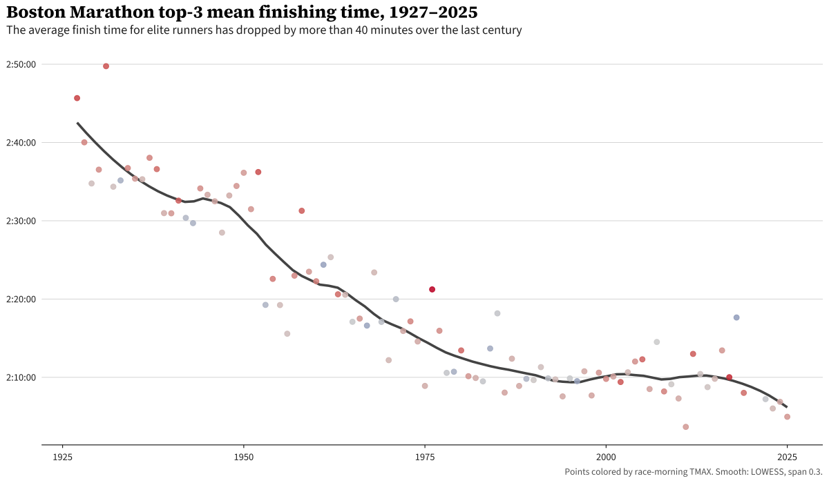
This confirms that runners have been getting better over time, though non-linearly. Between 1950 and the turn of the century, gains were substantial. Around the turn of the century, the rate of improvement flattened. However, there’s considerable year-over-year variation, which makes a ton of sense. Conditions vary widely. In fact, that 1976 race sticks out like a sore thumb in the middle of the plot.
This made me curious, how much of that variation can be attributed to weather conditions on race day, which I’ll dive into in this post.
Prior work
This is hardly a novel problem. There has been plenty of work done on this topic. Three to highlight:
- Ely, Cheuvront, Roberts & Montain (2007) — pools seven major marathons (including Boston) and divides race-day conditions into WBGT quartiles. For elite men (top-3 finishers), slowdowns go 1.7% → 2.5% → 3.3% → 4.5% as you move from cool to hot. This is the closest thing the literature has to a canonical “how much does heat cost” table.
- Wang et al. (2024) — the world’s top-96 individual marathon athletes (top 16 per continent) followed across events. Models a linear performance degradation above 15°C with slope ~0.39 min/°C for men, 0.71 min/°C for women. This is the first model I attempt to replicate.
- Galloway & Maughan (1997) — not a marathon study, actually. Eight cyclists rode to exhaustion at four temperatures in a lab. Peak endurance came at 10.5°C (~51°F); by 30°C performance had collapsed. This study models the performance degradation as a quadratic function, which I replicate in the second model. See also Maughan, Watson & Shirreffs (2007) for the thermoregulation review that carries the same physiology over to distance running.
My research
These studies give a great groundwork, but I wanted to dig in a bit deeper. Specifically a few questions:
- The literature suggests both linear and quadratic models, which can vary wildly as you get to extreme values. I was curious what this looked like, and what a less constrained fit would look like.
- Both have pretty strongly constrained functional forms. I was interested in a more data-driven approach, namely fitting the weather effect via a spline based model.
So I fit three Bayesian models, each on log-finishing-time. To control for athletic performance, each use a random walk, and each control for precipitation. The models differ in how race-day temperature enters:
- Wang-replication model: a linear hinge above 59°F, replicating Wang 2024’s functional form.
- Physiology model: a quadratic hinge above the same knot, motivated by the Galloway study.
- Spline model: replaces the hinge with a thin-plate spline, effectively letting the data pick the shape.
Each of the three models below is fit in brms with cmdstanr. Response is log_seconds (reader-facing numbers are back-transformed). All three include a state-space level (described below) to absorb improving performance over time, plus precipitation controls. Details on priors, convergence, and specifications live in the collapsible technical details at the bottom.
Controlling for athletic-performance improvement
Runners have gotten faster over the last century. Training methods modernized, footwear evolved, the global elite pool expanded. To measure weather effects, we need to account for that improvement and what performance would have looked like agnostic of weather.
I choose a simple approach to this, a random walk. Each year’s typical finishing time is the previous year’s, plus a small stochastic step. The size of this step is determined as part of the model fitting process. Notably, this does not impose a specific shape, just one wandering step-per-year.
This is a good fit for the following reasons:
- Uncertainty grows when you extrapolate. Predicting ten years past the data accumulates ten years of step variance; predicting one year ahead accumulates one. That matches reality — we know less about the far future than the well-measured middle.
- Year gaps are handled naturally. 1918 (WWI), 2020 (COVID), and 2021 (October race, omitted from the analysis) are missing from the data. The random walk weights its steps by the time elapsed, so the missing years cost us proportional information without breaking anything.
Here’s what the fitted year level looks like:
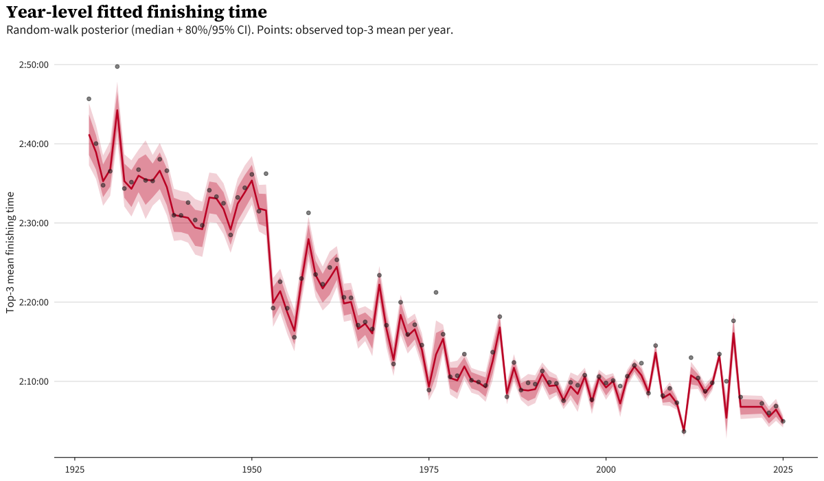
The red line is the model’s best guess of the typical finishing time for each year absent any weather effect; the bands are 80% and 95% credible intervals. The dots are the actual observed top-3 mean for each year.
If you haven’t worked with random walks often, you might ask: “the line just follows the dots — isn’t this just memorizing the data?” The random walk is regularized: each year’s step is constrained in size by a prior the data has to push against, so the line can track the broad pattern but can’t absorb every wiggle. The years where dots sit visibly above the red band (1976 again, plus 2012 and 2017) are years where something other than the long-run trend is at work, and that residual is what the weather model picks up. If the line went through every dot, there’d be nothing left for the weather term to explain.
In summary, this term captures the bulk year-over-year patterns not explained by the other model terms (like weather), and is temporally regularized so it can’t change too much from one year to the next.
One note is that this plot in particular highlights the 1953 drop from ~156 minutes to ~139 minutes. It seems that marathon was a perfect mix of a few factors: a 25-knot (29 mph) tailwind, 43 degree weather, a fast field, and a course that was found to over 1,000 yards short.
The actual brms implementation does this via a custom Stan block; the code is in the technical details at the bottom.
The Wang-replication model — linear hinge
First I reproduce the Wang model. The “hinge” is a kink at a fixed knot temperature: below the knot, there is no temperature effect — finishing time is flat. Above the knot, finishing time grows linearly with each additional degree. The biological story is that thermoregulation is essentially free until core-temperature rise becomes a problem, after which performance degrades steadily.
Explicitly:
\[\log(\text{seconds}) \sim \ell_{\text{year}} + \beta \max(T - k, 0) + \gamma \cdot \text{precip}\]Knot \(k\) at 59°F (15°C). Linear above the knot, exactly flat below by construction; \(\ell_{\text{year}}\) is the random-walk year level.
In brms syntax:
bf(
  log_seconds ~ 0 + I(pmax(tmax_f - KNOT_F, 0)) +
                precip_day + precip_missing,
  sigma ~ s(year, k = 10, bs = "tp")
)
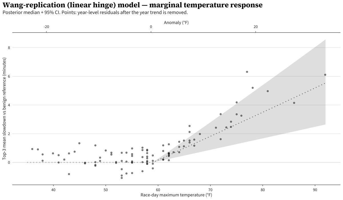
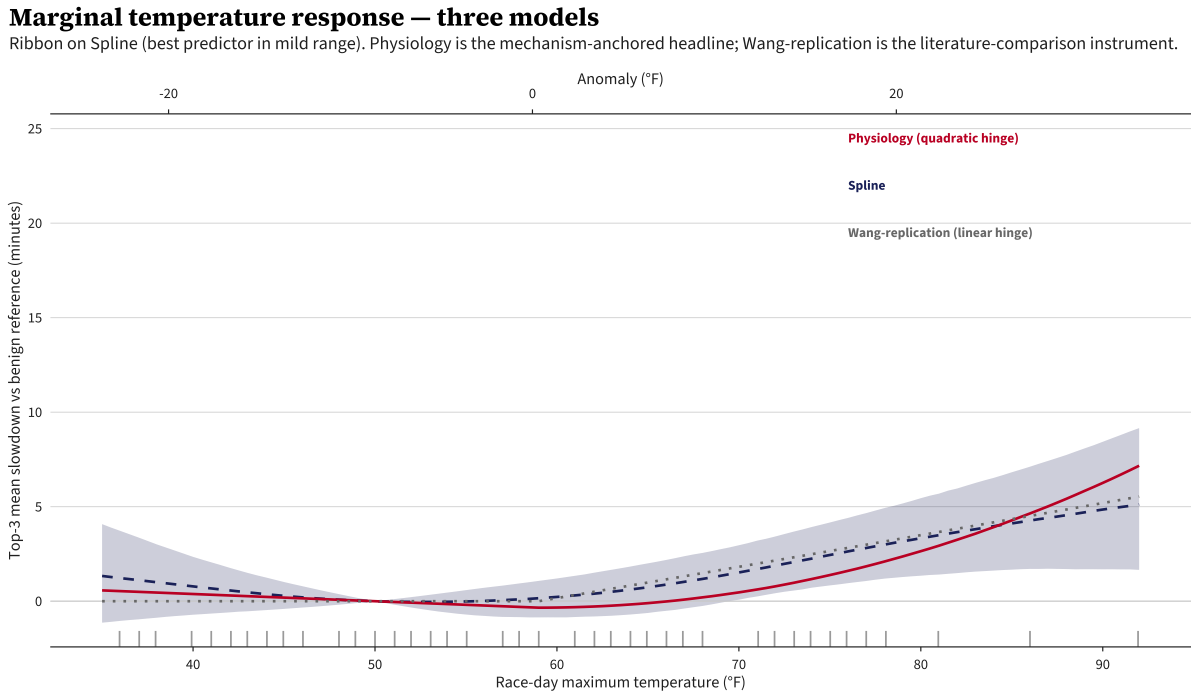
A quick note on how to read this and the next two plots: the y-axis is the predicted slowdown relative to a 50°F reference. Each curve is plotted with the model’s prediction at 50°F subtracted off, so all three pass through zero at 50°F — that’s a reporting anchor, not a model constraint. (The hinge models do have a structural flat region, but it lives below their 59°F knot, not specifically at 50°F.) 50°F is roughly the long-run Patriots’ Day average, so it’s a natural “benign weather” baseline to compare hot or cold years against.
The ribbon is the posterior 95% credible interval. The slope above 15°C comes out to 0.30 min/°C (95% credible interval [0.14, 0.46]), somewhat shallower than Wang’s pooled 0.39.1 This converts to about 10 seconds per °F above 59. The intervals overlap comfortably and the gap is consistent with the structural differences in the analyses - Boston is a single course, while Wang’s pooled estimate considers variation across many marathons.
The curve is exactly flat below 59°F because the model says it has to be: there’s no below-knot coefficient. By design, this model only makes claims above the hinge. The other two models allow for varying behavior for cold weather too.
The Physiology model — quadratic hinge
Next we do a Physiology-based model, which assumes temperature response is quadratic. Similar to Wang, we pin a knot at 59 degrees, however we allow for variation both above and below that knot:
\[\log(\text{seconds}) \sim \ell_{\text{year}} + \beta_1 \max(k - T, 0) + \beta_2 \max(T - k, 0)^2 + \beta_3 \cdot \text{precip}\]This approach is motivated by Galloway & Maughan (1997), a cycling study which found an inverted-U relationship with performance peaking at ~10.5°C. We shift the knot to 15°C to align with Wang’s runner-based study, but keep the quadratic functional form on both sides of it.
bf(
  log_seconds ~ 0 + I(pmax(KNOT_F - tmax_f, 0)) +
                I(pmax(tmax_f - KNOT_F, 0)^2) +
                precip_day + precip_missing,
  sigma ~ s(year, k = 10, bs = "tp")
)
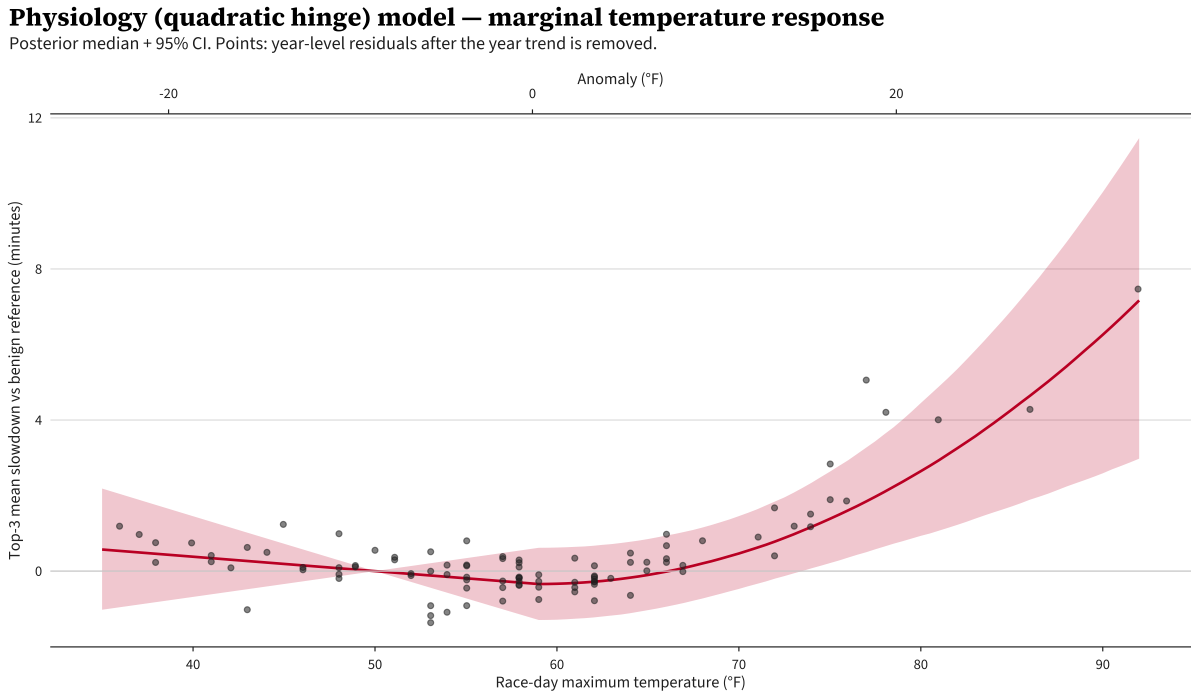
Despite allowing variation below the knot, it remains approximately flat below it. Above, we see strong quadratic behavior, however it is a bit alarming how close it gets to the 92°F day, which smells a bit overfit to me.
The Spline model
Last, I fit a model more of my own crafting, with a bit less structure than the literature, which more freely allows the data to drive the curve rather than strict functional form.
\[\log(\text{seconds}) \sim \ell_{\text{year}} + s(T_{\text{anomaly}}) + \beta \cdot \text{precip}\]Here, we just have the performance and precipitation controls, and a thin-plate spline on temperature. A thin-plate spline is a flexible curve fit through the data with a built-in penalty for getting too wiggly. One small change from the previous two models: the spline takes temperature as an anomaly (race-day max minus the day-of-year climatological average) rather than the raw °F. The hinge models needed a raw-scale variable to anchor the 59°F knot; the spline doesn’t have a fixed knot, so the climate-normalized version is the natural input (Boston’s Patriots’-Day climatology only varies by a few degrees across April, so the practical difference is small).
This model also adds a second equation letting the residual variance depend smoothly on year: the within-year top-3 SD shrinks across the century as the elite field densifies and pacing professionalizes.
bf(
  log_seconds ~ 0 + s(tmax_anomaly_f, k = 6, bs = "tp") +
                precip_day + precip_missing,
  sigma ~ s(year, k = 10, bs = "tp")
)
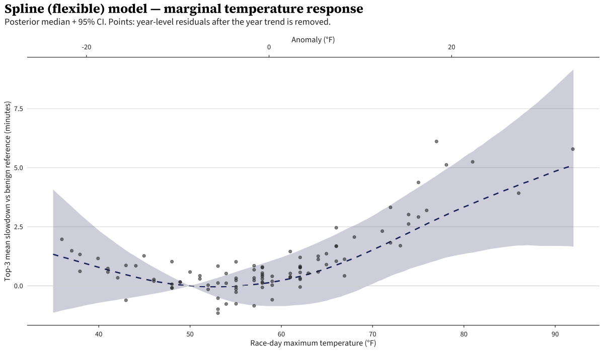
The Spline model agrees with the other two below ~80°F where the data is dense. Above 85°F the curve bends less aggressively than the Physiology model’s quadratic — with one data point above 90°F, the thin-plate prior pulls toward a simpler shape.
So What’s the Answer?
So we’ve got three different formulations to answer our question. However, we want one final answer, not three. Often, modelers will just select a “best” model. If we go by that heuristic, the Spline model wins through Leave One Out (LOO) cross-validation, a measure of how well the model predicts held-out observations. The “LOO Δ vs best (in SE)” shown below is the gap to the best model expressed in standard errors of that gap. Spline wins individual leave-one-out: Physiology is modestly worse (~2 SE), Wang-replication is clearly worse (~6 SE).
| Model | LOO Δ vs best (in SE) |
|---|---|
| Spline | 0 (best) |
| Physiology (quadratic hinge) | −2.1 |
| Wang-replication (linear hinge) | −5.9 |
However, I wanted to be a bit careful here. Notably, we’re in the area of outliers and extrapolation, dangerous waters for statistical models. In this regime, I err on conservatism where possible. There is plenty of literature that shows a many-models approach often beats a single, highly predictive model. That is what I chose to do here, known as Model Stacking: build a weighted mixture where each model’s weight is chosen to maximize the predictive performance of the combined model, following Yao, Vehtari, Simpson & Gelman (2018).
| Model | Stacking weight (95% bootstrap CI, B=200) |
|---|---|
| Spline | 0.18 [0.14, 0.27] |
| Physiology (quadratic hinge) | 0.55 [0.50, 0.65] |
| Wang-replication (linear hinge) | 0.27 [0.17, 0.31] |
Stacking can favor a model that isn’t the best individual predictor, and we see that here — the largest contributor to the blend is the quadratic Physiology model, not the Spline. Stacking asks “if I’m allowed to combine the three models into one weighted prediction, what weights minimize the combined prediction error?” A model can be a slightly worse solo predictor and still earn high mixture weight if it makes its mistakes in different places than the others. Uncorrelated errors cancel out when blended. The Physiology model is more aggressive at the tails, predicting a higher heat penalty than the other two. The Spline and linear hinge models make similar predictions to each other, so they contribute redundant information. The Physiology model’s distinct behavior is what earns it a higher weight in the blend.
That being said, the data-rich region appropriately is the most impactful in fitting the models, but we assume it cleanly extrapolates to a less saturated region. The mixture’s weights reflect predictive accuracy in mild conditions, and we’re assuming that accuracy carries to the heat tail, which may not be a perfect assumption. For the rest of this post I report the stacked mixture as the headline. The Spline is the natural single-model starting point (it’s the best individual predictor), but for an extrapolation question with a single anchoring data point at 92°F, leaning on a blend that incorporates the mechanism-committed Physiology and Wang-replication models is the more defensible read.
Effect of Weather on Final Race Times
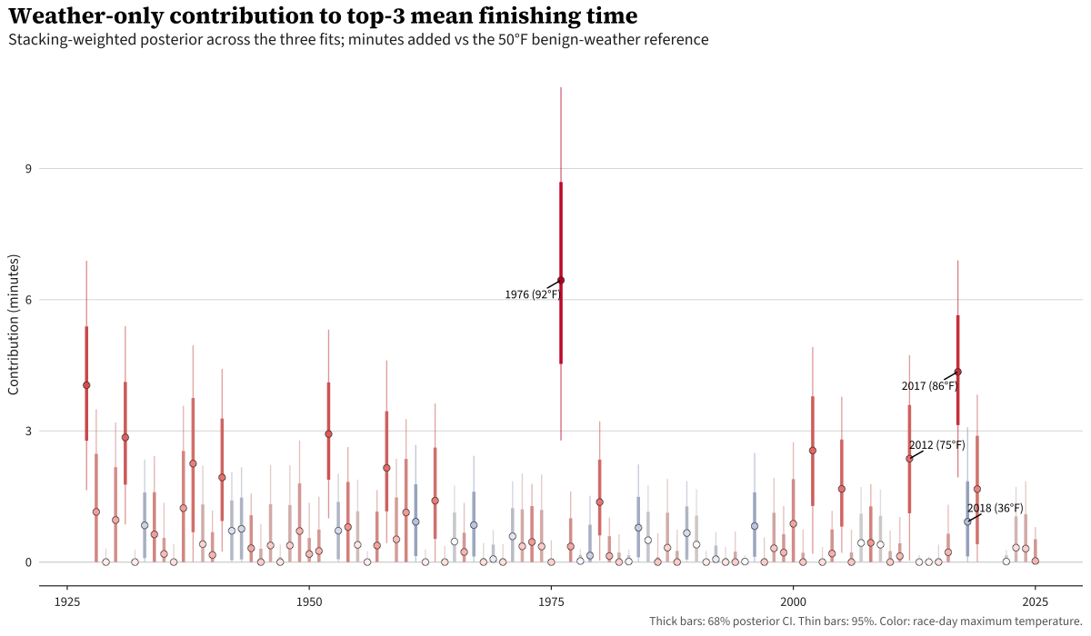
For every race-year in the panel, the stacked model estimates the weather-only contribution to that year’s top-3 average finish time: the difference between what the model predicts happened and what it would have predicted on a 50°F day. Note that by construction, this contribution is bounded below at zero: each model’s marginal curve has its minimum at the 50°F reference so any departure from the reference is by construction non-negative.
Most years cluster within a minute of zero. Two stand clearly above, 1976 and 2017. 2018 in particular is interesting: the model predicts a slowdown as a result of cold weather, rather than heat.
The 1976 counterfactual
In an alternate universe where it was a 50°F Patriots’ Day in 1976, the stacked mixture estimates the 1976 top-3 mean would have been faster by 6:27 (95% credible interval 2:47–10:52).
For context, by model: the Physiology model alone says 7:21 (the largest of the three), the Wang-replication model says 5:44, and the Spline model says 5:20.
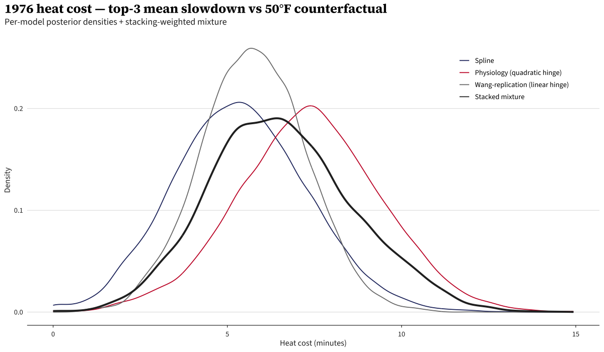
The figure shows each model’s full posterior density side-by-side. The model identifies a cohort-level heat effect — every finisher in the field gets shifted by the same amount, so the counterfactual time is the same for each place by construction:
| Place | Runner | Actual time | Counterfactual time |
|---|---|---|---|
| 1 | Jack Fultz | 2:20:19 | 2:13:52 |
| 2 | Mario Cuevas | 2:21:13 | 2:14:46 |
| 3 | Jose DeJesus | 2:22:10 | 2:15:43 |
Observed top-3 mean: 2:21:14; the model’s 50°F counterfactual top-3 mean is 2:14:47.
2026 prediction
I still have 40 minutes until I’m technically allowed to burn the midnight oil, but I did do my last data pull as I wrapped up this piece at 11:20 pm in Boston, the night before the race. The NWS forecast for Hopkinton is 48°F, near perfect conditions. Under that weather, the stacked mixture predicts basically no temperature-related penalty and a top-3 mean of 2:05:10 with a 95% posterior predictive interval of 1:57:54–2:12:29. Obviously this is an incredibly wide interval. It would be remarkable to beat the world record of 2:00:35 on Boston’s famously difficult course, and 11% of our posterior probability claims the average of the top-3 finishers would be below that. However, that is to be expected given we formulated this as a weather model, not a performance forecasting model.
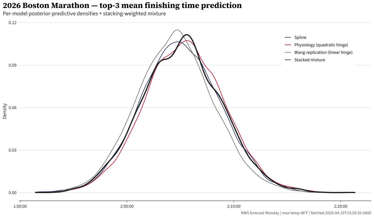
Of course, these curves all look similar, which is a result of the forecast being near-perfect.
Good luck to all the runners out there!
Caveats
Temperature is a proxy. The best marathon-performance studies use WBGT (wet-bulb globe temperature), which incorporates humidity, radiation, and wind. Blue Hill doesn’t have continuous dewpoint data until 2006 or wind data until 1998 at Logan. I kept maximum temperature + a precipitation indicator for simplicity.
DNF selection. The 1976 top-3 is the 3 best finishers, not the 3 best in the field. Rodgers and Fleming dropped out — athletes who ran 2:09 and 2:12 on 50°F in 1975 and 1977. This selection bias affects the study, but I kept the top-3 framing following the precedent set by Ely 2007.
Technical details
Full model specifications, priors, and convergence
All models fit in brms with the cmdstanr backend, 4 chains × 2000 post-warmup draws (2000 warmup), adapt_delta = 0.995. The state-space level uses a non-centered parameterization (sample standardized innovations tilde_l ~ N(0,1), build ll[y] deterministically) to avoid Neal’s funnel.
State-space level (shared across all three models)
parameters {
  real ll_init;
  vector[Y] tilde_l;
  real<lower=0> sigma_l;
}
transformed parameters {
  vector[Y] ll;
  ll[1] = ll_init;
  for (y in 2:Y) {
    ll[y] = ll[y-1] + sigma_l * sqrt(dt[y]) * tilde_l[y];
  }
}
model {
  ll_init  ~ normal(9, 0.3);
  tilde_l  ~ std_normal();
  sigma_l  ~ normal(0, 0.05);
}
Per-row mean predictor adds ll[year_idx[n]]. The √dt scaling on the innovation honors race-cancellation gaps (1918, 2020, 2021). Note this is a simplification: the full Harvey 1989 covariance for a level-only RW is the same, but if we’d been able to fit a local linear trend the gap variance would underestimate by ~1 year × σ_β per gap. Documented for completeness.
Spline model — flexible spline (mean) + year-only sigma sub-model
bf(
  log_seconds ~ 0 + s(tmax_anomaly_f, k = 6, bs = "tp") +
                precip_day +
                precip_missing,
  sigma ~ s(year, k = 10, bs = "tp")
)
The ~ 0 suppresses brms’s automatic intercept, since the state-space level ll[1] carries the baseline. The sigma sub-model is s(year) only — I tested adding s(tmax_anomaly) to the variance equation, but at three observations per year there’s no power for within-year heat-variance signal (posterior dominated by prior). The s(year) term retains a real 4× signal across the century (within-year SD shrinks as the elite field densifies).
Physiology model — quadratic hinge
bf(
  log_seconds ~ 0 + I(pmax(knot_f - tmax_f, 0)) +
                I(pmax(tmax_f - knot_f, 0)^2) +
                precip_day +
                precip_missing,
  sigma ~ s(year, k = 10, bs = "tp")
)
Wang-replication model — linear hinge
bf(
  log_seconds ~ 0 + I(pmax(tmax_f - knot_f, 0)) +
                precip_day +
                precip_missing,
  sigma ~ s(year, k = 10, bs = "tp")
)
Knot fixed at 59°F across B and C.
Priors
| Parameter | Prior | Justification |
|---|---|---|
| Intercept | normal(9, 0.3) |
log(7920s) ≈ 8.98; ±2σ covers the 1:40–2:55 elite range |
s(year) SD |
normal(0, 0.30) |
Total 1927→2025 year effect ≈ 0.4 on log scale |
s(tmax_anomaly) SD (Spline model) |
normal(0, 0.18) |
Prior predictive 97.5% tail at 90°F vs 50°F is ~30 min slowdown |
| Hinge coefficients (Physiology + Wang-replication) | normal(0, 0.05) |
Above-knot effects on log scale; ±2σ covers ±10% per °F departure |
| precip indicator | normal(0, 0.05) |
Wet vs dry ±2σ covers ~±10% effect on finishing time |
Convergence
| Model | max Rhat | min bulk-ESS | min tail-ESS | divergent transitions |
|---|---|---|---|---|
| Spline | 1.004 | 1407 | 2380 | 0 |
| Physiology | 1.002 | 1225 | 2163 | 0 |
| Wang-replication | 1.001 | 1476 | 3112 | 0 |
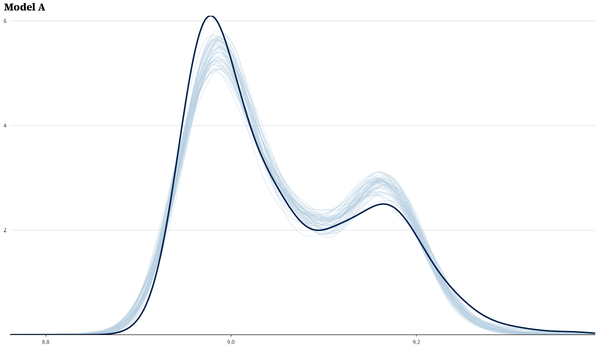
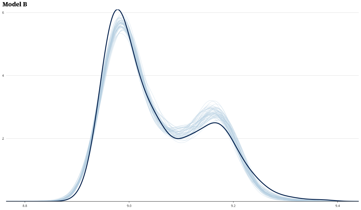
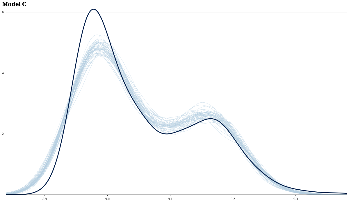
Prior predictive and posterior predictive checks
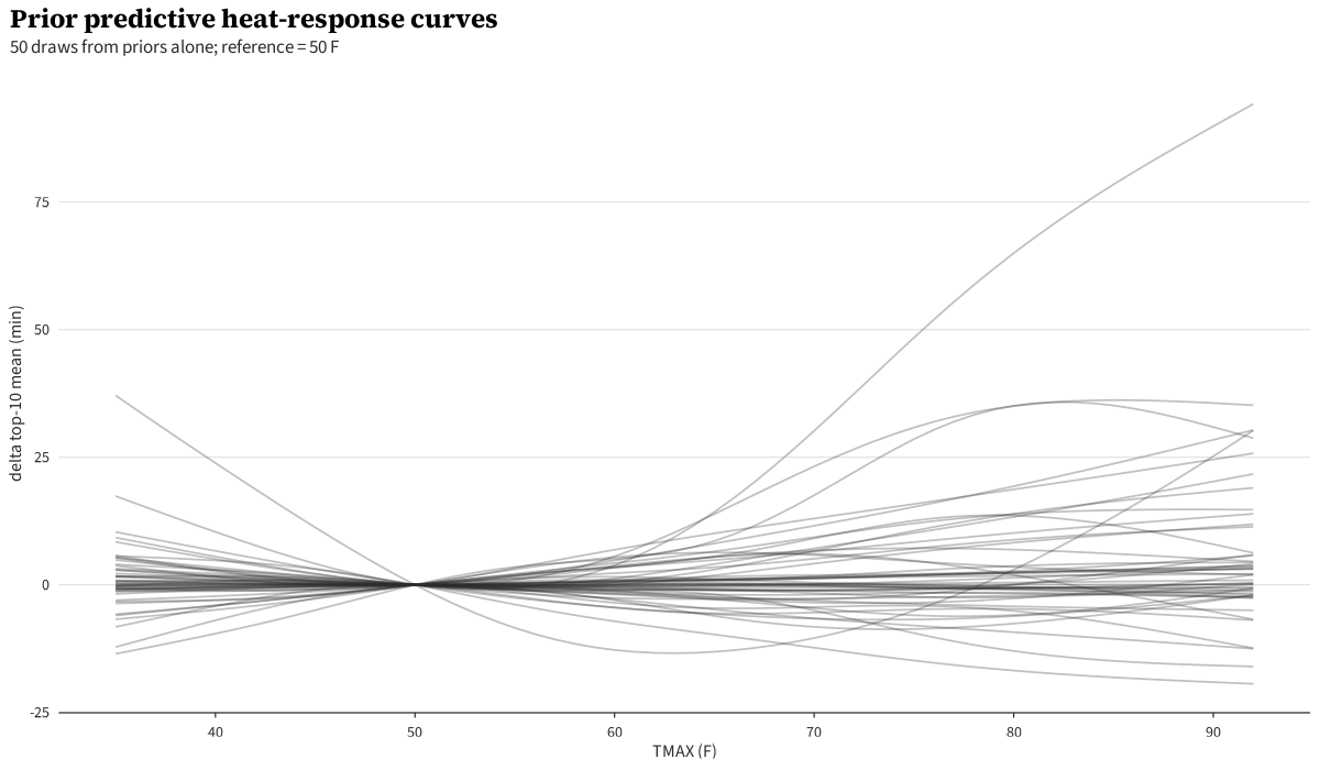
The prior predictive generates plausible top-3 time distributions across the TMAX range.
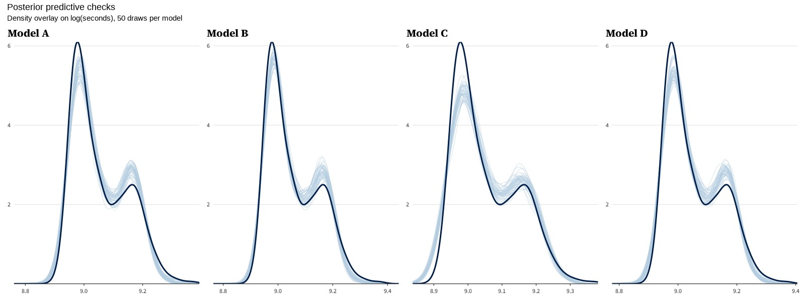
Posterior predictive checks for all three models. Per-model PPCs:
LOO comparison and stacking weight bootstrap
Values this large are the expected signature of the Pareto-k > 0.7 degeneracy described below; only the ratio is meaningful.
| Model | ELPD-diff | SE-diff |
|---|---|---|
| Spline | 0.0 | 0.0 |
| Physiology | -2168949.5 | 1014288.0 |
| Wang-replication | -8524375.6 | 1454564.9 |
Absolute ELPD-LOO and p-LOO are omitted because state-space LOO is degenerate here — every observation has Pareto-k > 0.7, the latent year level is informed by all years, and leaving out a single observation fundamentally changes the inference. The ELPD-diff / SE-diff ratios above are still useful as a relative ranking signal, but the absolute predictive log scores are not interpretable on their usual scale.
Stacking weights with bootstrapped 95% CIs (200 bootstrap samples, resampling races with replacement):
| Model | Stacking weight (95% bootstrap CI, B=200) |
|---|---|
| Spline | 0.18 [0.14, 0.27] |
| Physiology (quadratic hinge) | 0.55 [0.50, 0.65] |
| Wang-replication (linear hinge) | 0.27 [0.17, 0.31] |
The Physiology model’s CI doesn’t overlap the other two, identifying it as the preferred mixture component even on this small panel — corroborating the mechanism-anchored choice independently.
Knot sensitivity
The Physiology and Wang-replication models both fix the hinge knot at 59°F (15°C) a priori from Galloway/Wang; the sensitivity sweep below is reported for transparency, not for slope selection. Sweep at 55/57/61/63°F (Physiology model heat-cost shown):
| Knot (°F) | 1976 top-3 mean heat cost (min) | 95% CI |
|---|---|---|
| 55 | 7.2 | [3.4, 11.2] |
| 57 | 7.2 | [3.3, 11.3] |
| 59 | 7.4 | [3.2, 11.5] |
| 61 | 7.2 | [2.9, 11.6] |
| 63 | 7.4 | [2.9, 11.8] |
The Physiology-model headline is robust across knots — within 0.2 min of the canonical 59°F value, well inside the within-knot CI width. Knot location is not a meaningful researcher degree of freedom for the headline.
For the Wang comparison, the Wang-replication model’s above-knot slope per knot:
| Knot (°F) | Above-knot slope (min/°C) | 95% CI |
|---|---|---|
| 55 | 0.24 | [0.10, 0.39] |
| 57 | 0.27 | [0.12, 0.42] |
| 59 | 0.30 | [0.14, 0.47] |
| 61 | 0.33 | [0.15, 0.51] |
| 63 | 0.36 | [0.16, 0.56] |
The Wang-replication model’s slope grows monotonically with knot (more leverage from a sharper threshold). At the canonical 59°F we get 0.30 min/°C; the slope at knot=63°F approaches Wang’s pooled 0.39. The CIs overlap Wang’s value at every knot we tested.
Across-model marginal curve (envelope)
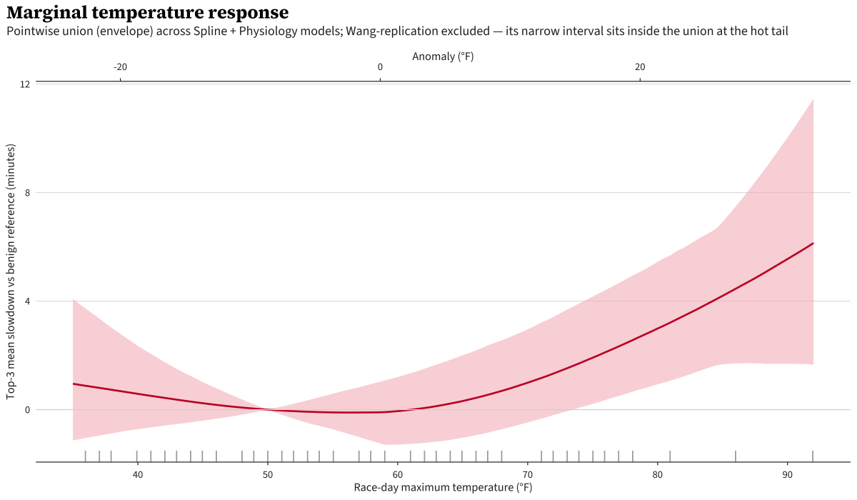
The envelope is the pointwise union of the three models’ 95% intervals across TMAX. The decomposed view shows the three curves separately for comparison.
Acknowledgments and sources
- NOAA GHCN-Daily for Blue Hill weather records and 1991–2020 Climate Normals for the climatology baseline.
- adrian3/Boston-Marathon-Data-Project for pre-2019 race results.
- The Boston Athletic Association for historical results 2019–2025 and race-date records.
- Paul Bürkner’s
brmsand the Stan developers. - Matt Porter for getting my wheels spinning on the problem.
-
All “95% CI” values in this post are 95% Bayesian credible intervals (the central 95% of the posterior), not frequentist confidence intervals. I’ll abbreviate as “95% CI” in tables for compactness. ↩
Cite This Post
@misc{burch2026weather-effects-boston-marathon,
  author       = {Tyler James Burch},
  title        = {Weather Effects on Boston Marathon Times},
  year         = {2026},
  month        = {April},
  howpublished = {\url{https://tylerjamesburch.com/blog/statistics/weather-effects-boston-marathon}},
}